Miko
Description
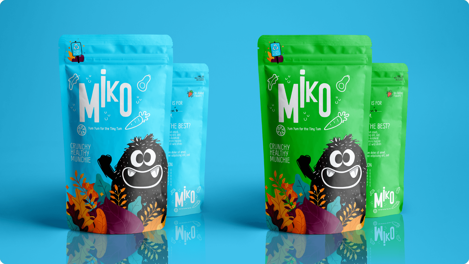
Miko is a premium food brand for kids. The ideology and aim while designing the brand was to make it attractive and memorable for both kids and adults. 'Miko' is Japanese for a beautiful child. It's not only easy to pronounce but it also conveys the love and care for a kid. Miko is an organic healthy snack brand for kids. It is made from fruits and vegetables and caters to kids between the age of 2-10. It is a healthy snack but the aim was to make it NOT boring. To achieve this the packaging plays around with popping colors and interactivity. Research revealed, that elements that catch a kid's attention are bright popping colors, shapes, and characters. I combined them into something playful by creating a character for the brand and using it in packaging and at different places.
Services
Brand Identity & Name
, Packaging
, Character Design


